CASE STUDY — COLUMBUS ARBORFEST
A festival brand built to come back every year.
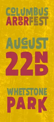
For the 3rd annual Columbus ArborFest in August 2026, Zach volunteered as creative director. The festival needed a 2026 look that supports its original logo, works on every screen and printed piece, and can be reused year after year. We built that theme, then designed and printed the pieces that carry it.
- Client
- Columbus ArborFest
- Event
- 3rd annual, August 22, 2026, Whetstone Park of Roses
- Presented by
- Columbus GreenSpot & The Davey Tree Expert Company
- Role
- Volunteer creative director
- What we made
- Brand kit, digital billboard, map, program, signage, banners, flyers, apparel
The job
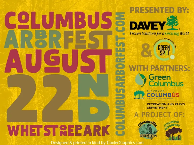
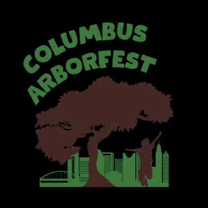
ArborFest already had a logo, designed by Noah Faust. What it needed was a system around it: a type and color theme for 2026 that supports the original mark and gives the committee one consistent look across social media, print and signage. It also had to last. The theme was built so printed pieces can be used again year after year instead of being redesigned and reprinted every August.
What we made
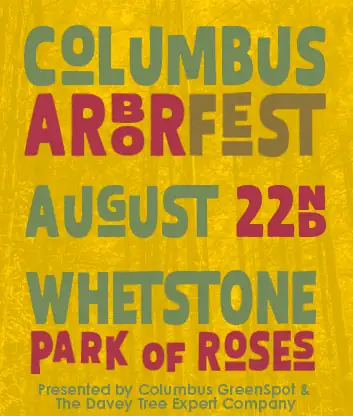
- The 2026 theme. A new display typeface, Thierry Leonie, and a color palette that play off the original festival logo. The theme became the festival’s brand kit.
- A Canva brand kit for the committee. Fonts, colors and logo files set up in Canva, so committee members can make on-brand graphics themselves.
- Social media graphics aligned to the theme.
- A digital billboard downtown. A large-format digital billboard on the Heartland Bank building in downtown Columbus, promoting the festival, designed in wide and tall formats.
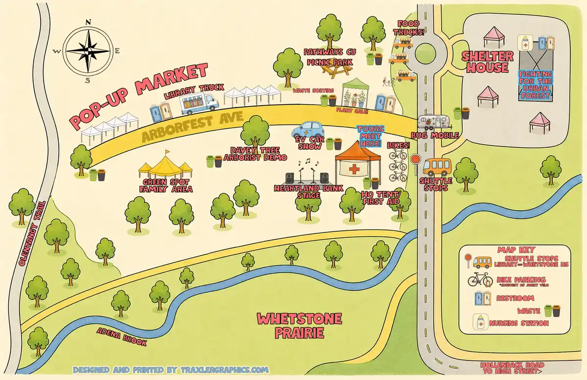
- An illustrated festival map, drawn to work digitally and in print.
- The festival program, a double parallel fold brochure with the map inside.
- The activity schedule and poster suite, built for print posters, social posts and every ratio between.
- Signage, banners and coroplast yard signs, all new, designed and printed.
- Flyers, designed and printed.
- Festival apparel, designed and printed.
And on the day, Zach was there as a volunteer too.
System first, then every format
The easy mistake on a job like this is to design the big poster first and squeeze everything else out of it. The square social version ends up with type nobody can read on a phone. We set the rules first instead: one display face, a fixed hierarchy for event names, times and places, and a grid that can stretch or stack. Then every piece, from a yard sign to a program panel to a downtown billboard, got its own pass so it reads at the size people actually see it.
A brand the committee can run
A brand kit only works if the people making next week’s post can use it. With the kit in Canva, the committee’s graphics match the printed pieces without waiting on a designer for every update, and the map, signs and program carry the same look from the first announcement to festival day.
Running an event?
If your festival or event needs a look that lasts, a map, a program, or the signs, shirts and banners that go with it, we would like to hear about it. See nonprofits & events.
If it can be printed, we make it.
One studio for brand, print, apparel, and web — in Columbus, Ohio.
Start a Project →